AI has changed the game. A few lines of text, a click of a button, and you have a photorealistic render that would have taken a specialist studio days and thousands of dollars to create just a few years ago.
What was once a rare luxury, a high-fidelity, client-wowing render, is now a cheap and fast commodity. But in the design world, I’m seeing it do more harm than good.
This newfound ease isn’t just a shortcut; it’s a trap. And I fear we are shooting ourselves in the foot.
The Curse of the "Perfect" Image
The problem isn’t the tool. It’s the perception.
In the design process, the quality of an image has always been a silent communicator of its position in the process. A rough sketch communicates a fleeting thought. A CAD model implies the geometry is being tested. And a photorealistic render has always connoted a close to final design.
AI has completely broken this visual structure.
Now, we can generate a “final” looking image in the first five minutes of the creative process. This is where the danger lies. When people see a polished, beautifully finished render, they instinctively assume the idea is well-resolved, and complete.
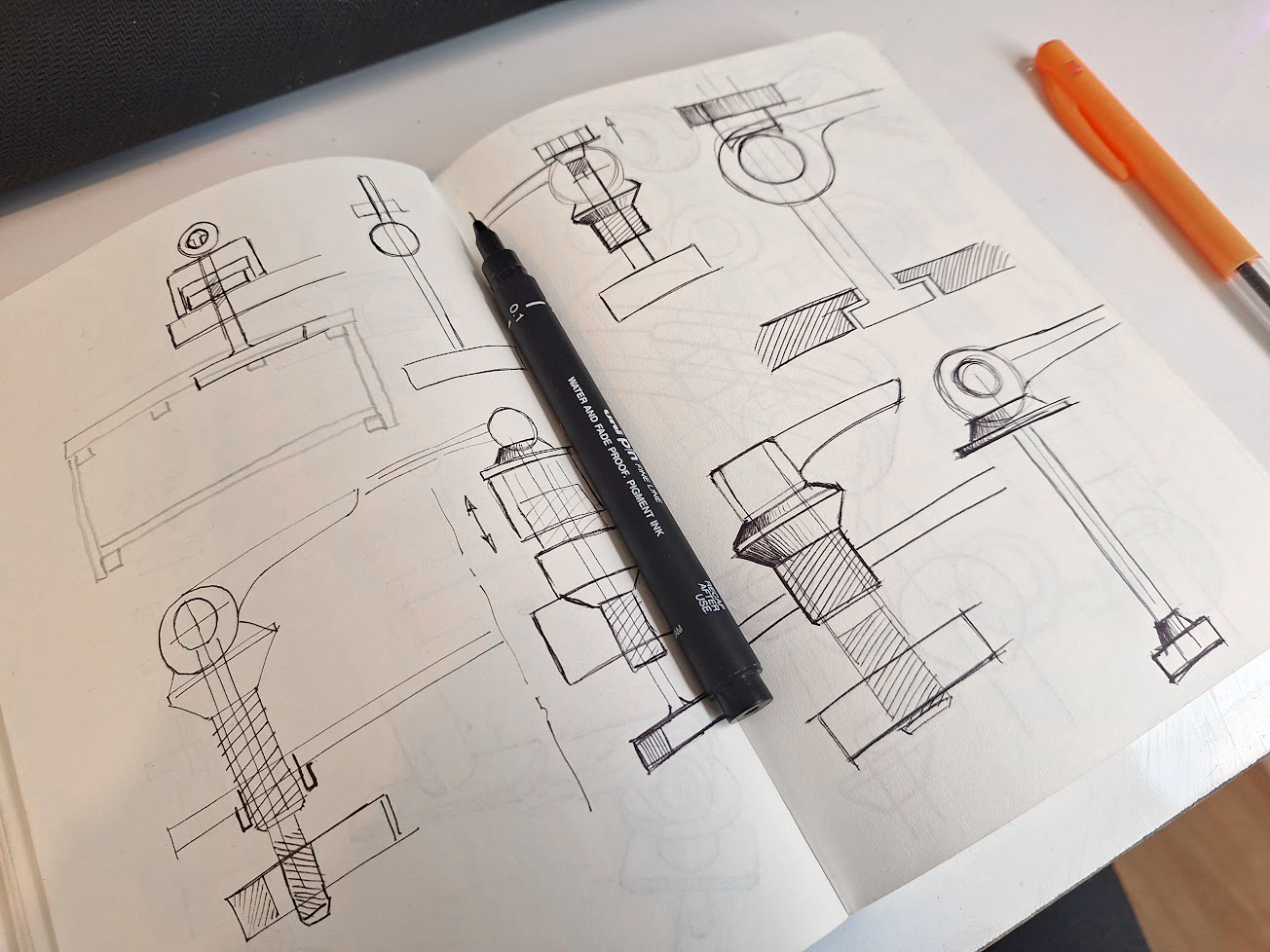
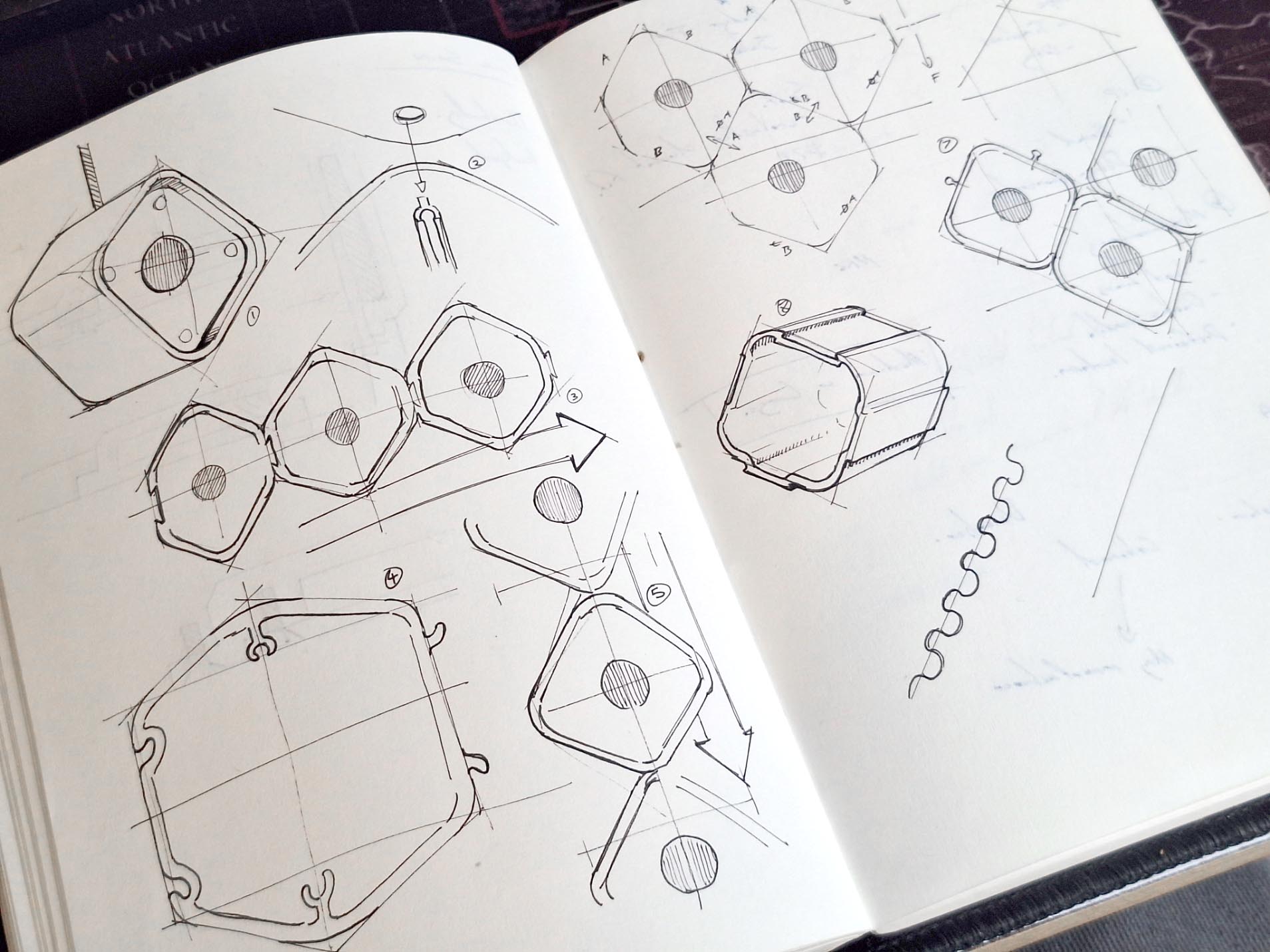
I’ve seen it in meetings. People get visibly reserved when you present a rendered image. They are hesitant to critique it. It looks finished to them. Yet, when presented with a loose sketch, a pen and scribble over the top is exciting. It gets them engaged, levels the playing field, and most importantly collaborating.
A sketch is often seen as a question, whereas a render can be mistaken as more of a statement. The “perfect” render prematurely freezes the design. It implicitly asks for validation, not critique . It silences the essential conversation that design thrives on.

The Process is the Pinnacle, Not the Picture
We’ve been misguided. We’ve been led to believe that the pinnacle of the design process is a pristine presentation wall with premium drawings scattered across it.
This is wrong.
The true pinnacle of design shouldn’t be a wall. It should be a desk littered with napkin sketches of loose thoughts, material samples, and messy, failed tests.
The purpose of design is not to produce a single, perfect result straight away. The purpose of design is to quickly explore ideas, communicate those ideas with others, and test your assumptions. It’s a journey of discovery and inspiration.
By starting with a “perfect” image, we skip the most valuable parts of that journey. We can easily get locked into the first good-looking idea, not the best idea.

Praise the Humble Scribble
This brings us to the humble napkin sketch. In an age of infinite AI perfection, we must be careful not to see this simple tool as “lesser.”
If an AI-generated image allows you to quickly explore 50 variations of a layout to test an assumption, great, use it. But we can’t loose sight of how a scribbled sketch allows for a level of detail, ambiguity, and universal creative freedom that is currently unmatched.
It’s all about showing thinking and whatever connects the brain to the page, solving problems in real-time without all the fluff. Designers need to create a transparent record of their thoughts and invite others to join in. It shouldn’t be perfect, that’s the whole point. However because we all love a shiny thing, AI is easily distract us and devaluing anything less visually appealing.
Yes, we can use these powerful new tools, but we must become masters of when and how we use them. If we don’t, I’m worried we risk trading the rich, collaborative, and messy process of true design for the hollow victory of a beautiful, uncontested picture.
More recently, I’ve strived to go back to basics and create workflows that encourage better collaboration and fluidity as the project matures. This involves shamelessly uploading rough scribbles and mockups without the glitter or flair.
This isn’t me preaching against the uprising or attempt to convince you all to cancel your ChatGPT subscription. But rather a reminder that value is not on the quality of the image, but rather the ideas it depicts and the conversations that follow.


